
Vreni Romang, PTC’s Publicity Manager, sat down with Phillip R. Lowe – PTC’s Resident Costume Designer and designer for The Lion in Winter.

Vreni Romang, PTC: What was the design process for The Lion in Winter?
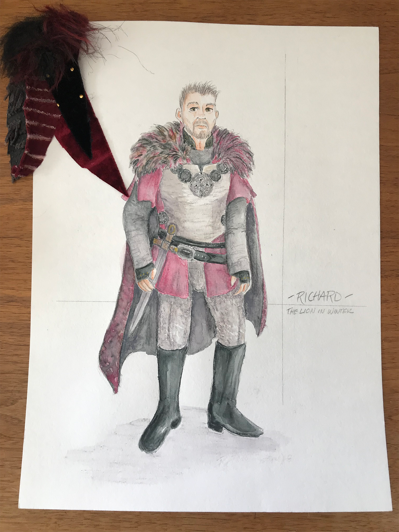
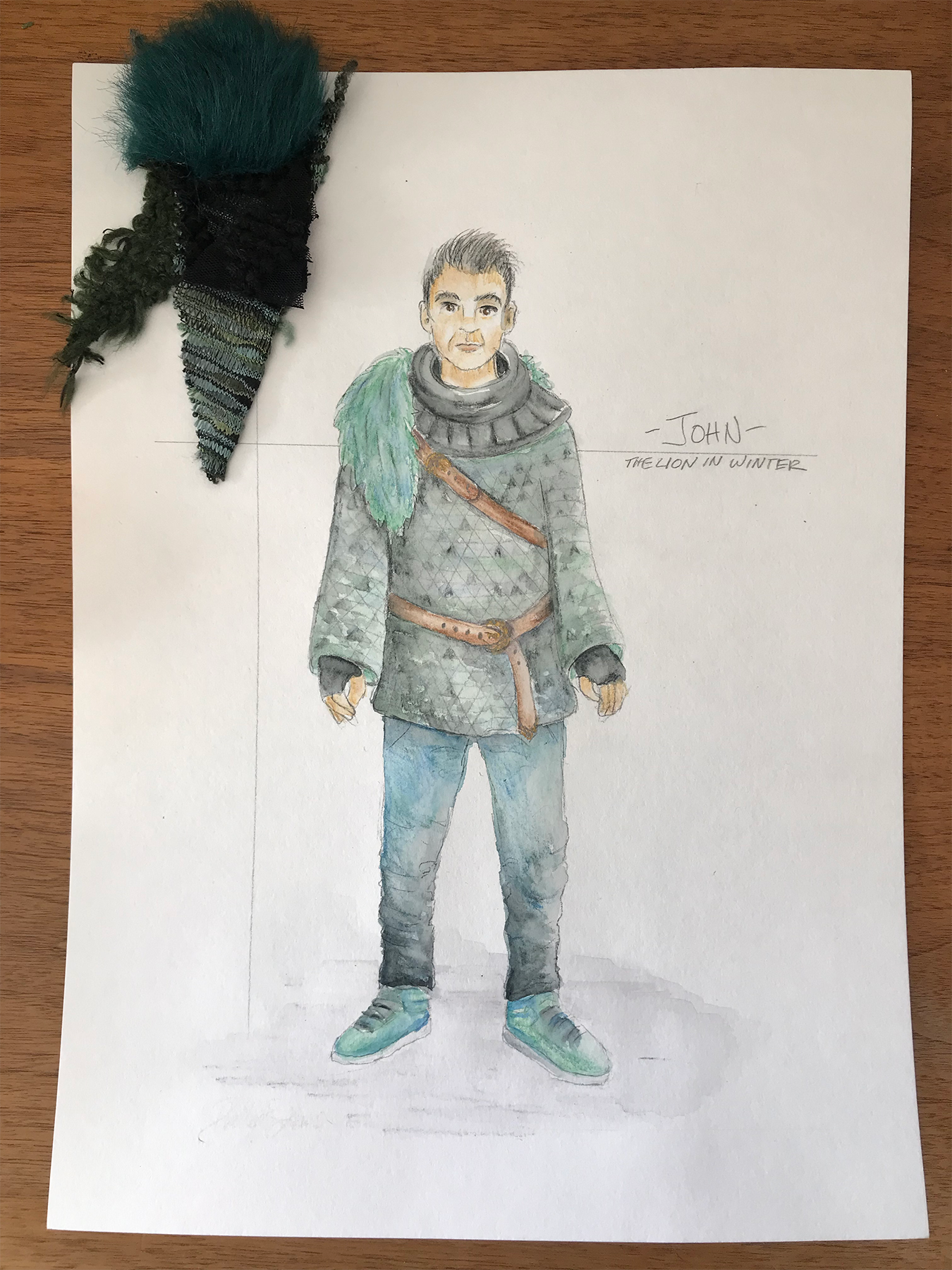
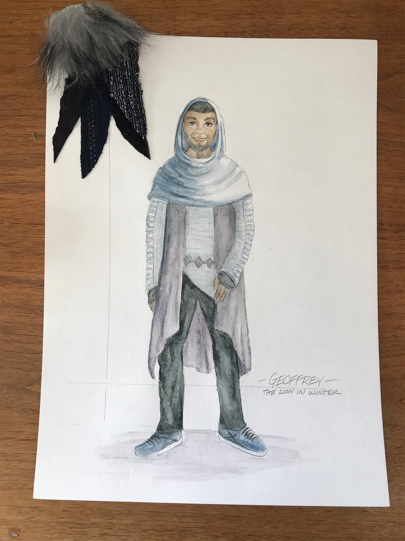
Phillip R. Lowe, Costume Designer: Our initial production meeting with Wes [Grantom, the director] and the other designers was really emphasizing the modern feel of this play. The trick is that part of the comedy of this play comes from the fact that it’s old-timey people having modern-timey problems. I really wanted the silhouettes to have this look, like “Game of Thrones” or Robin Hood – we automatically know it’s something medieval. But as you look closer at the pieces a lot of the fabric choices are very contemporary. As the play goes on people lose capes and armor and certain pieces come off; then by the time we get to the end of the show, you know, the three boys specifically look almost contemporary. The footwear choices and the jewelry choices all have a modern twist to it.
They literally say it’s 1183 – but I’ve enjoyed toying with those lines and looks and trying to make them appealing to a contemporary eye.
VR: What would you call the medieval look?
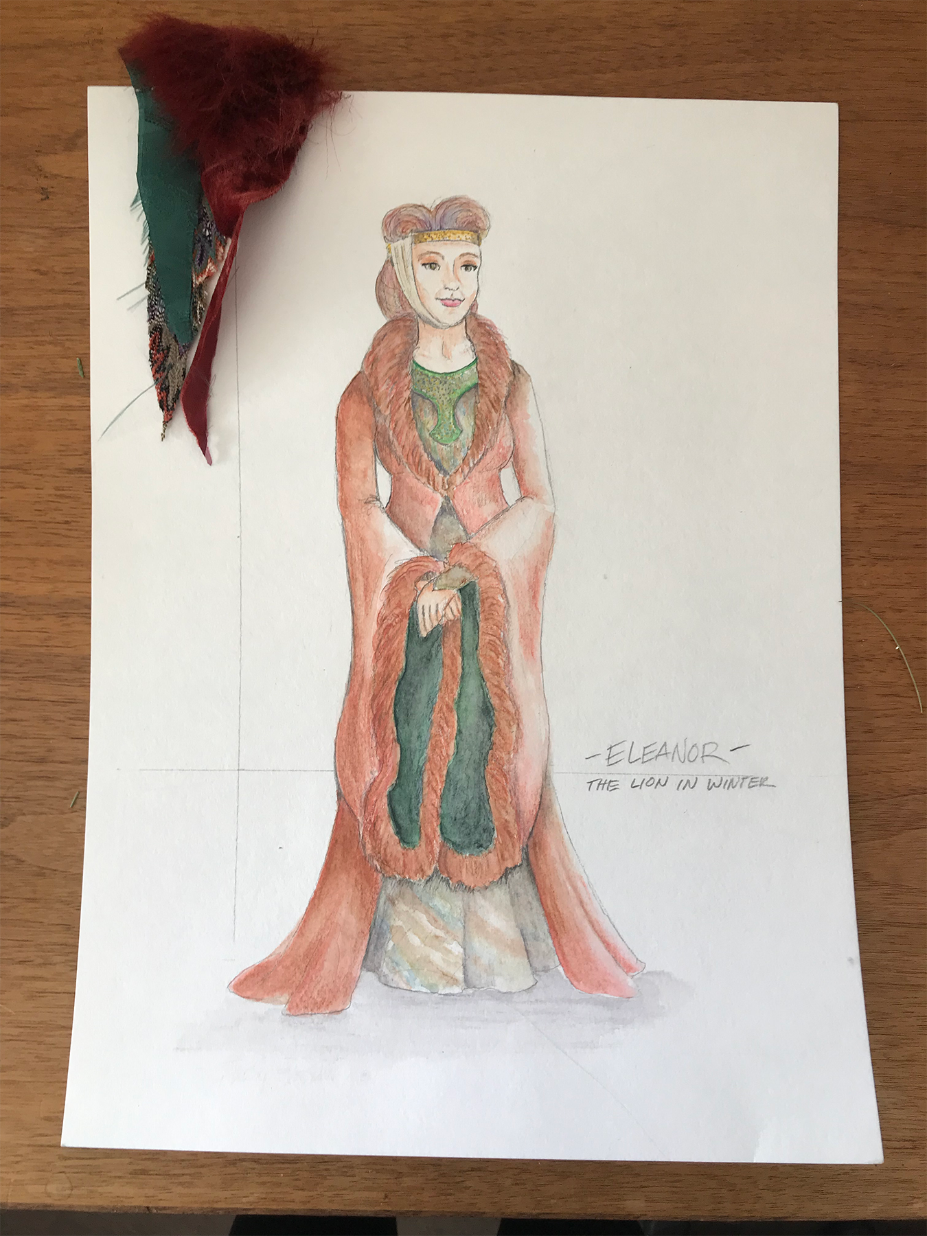
PL: A lot of how we think of nuns looking like; a lot of those orders started back in the 12th century. For instance, the wimple that’s tight around the face, that covers the face and neck – those looks started during this time period. Even Eleanor’s first look has a modified version of that, where her crown has this sheer-ish chin strap on it. But if she had a veil on it, it would still be that silhouette. So, you know, I was trying to take these old-timey looks and make them feel modern and fashion-y.
VR: The colors in the show are so beautiful – was there any psychology at play? Was John “green with envy,” for instance?
PL: Well the psychology of color is always something I think about. It’s not something I necessarily design with or do intentionally. You can’t do things like “green means envy” or “red means passion or pain,” you can’t be that prescriptive about color – but colors can affect us. And red does draw our attention, so with Richard being the forceful one of the group, that seemed right on him. Green, yes, it can be envy; there’s something sickly about green, there’s something moody about green too. Blue is a color we see around us a lot and we kind of dismiss it, which is why I chose it for Geoffrey, cause he’s the one that no one pays attention to.
But when you get the three of them together, the red and green pop more than the blue one does because they’re complementary – they’re the opposite sides of the color spectrum.